Multiple line plots
Often one wants to plot many signals over one another. There are a few ways to do this. The naive implementation is just to add a constant offset to each signal:
   1 from pylab import plot, show, ylim, yticks
   2 from matplotlib.numerix import sin, cos, exp, pi, arange
   3
   4 t = arange(0.0, 2.0, 0.01)
   5 s1 = sin(2*pi*t)
   6 s2 = exp(-t)
   7 s3 = sin(2*pi*t)*exp(-t)
   8 s4 = sin(2*pi*t)*cos(4*pi*t)
   9
  10 t = arange(0.0, 2.0, 0.01)
  11 plot(t, s1, t, s2+1, t, s3+2, t, s4+3, color='k')
  12 ylim(-1,4)
  13 yticks(arange(4), ['S1', 'S2', 'S3', 'S4'])
  14
  15 show()
but then it is difficult to do change the y scale in a reasonable way. For example when you zoom in on y, the signals on top and bottom will go off the screen. Often what one wants is for the y location of each signal to remain in place and the gain of the signal to be changed.
Using multiple axes
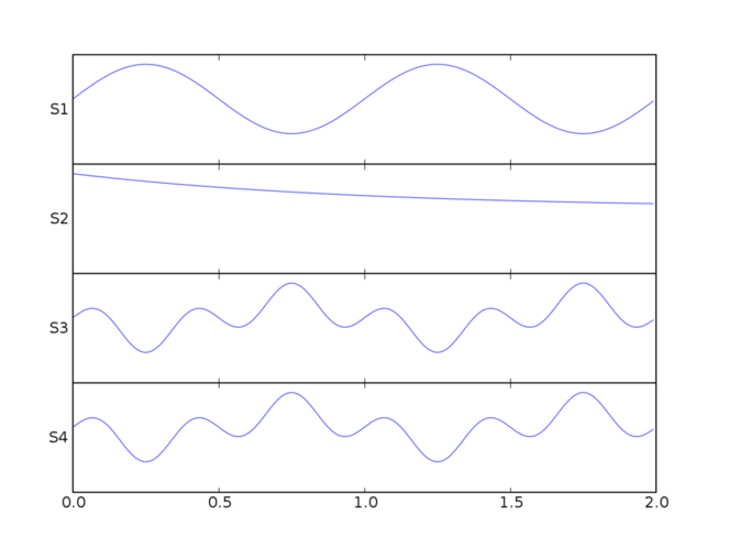
If you have just a few signals, you could make each signal a separate axes and make the y label horizontal. This works fine for a small number of signals (4-10 say) except the extra horizontal lines and ticks around the axes may be annoying. It's on our list of things to change the way these axes lines are draw so that you can remove it, but it isn't done yet:
   1 from pylab import figure, show, setp
   2 from matplotlib.numerix import sin, cos, exp, pi, arange
   3
   4 t = arange(0.0, 2.0, 0.01)
   5 s1 = sin(2*pi*t)
   6 s2 = exp(-t)
   7 s3 = sin(2*pi*t)*exp(-t)
   8 s4 = sin(2*pi*t)*cos(4*pi*t)
   9
  10 fig = figure()
  11 t = arange(0.0, 2.0, 0.01)
  12
  13 yprops = dict(rotation=0,
  14               horizontalalignment='right',
  15               verticalalignment='center',
  16               x=-0.01)
  17
  18 axprops = dict(yticks=[])
  19
  20 ax1 =fig.add_axes([0.1, 0.7, 0.8, 0.2], **axprops)
  21 ax1.plot(t, s1)
  22 ax1.set_ylabel('S1', **yprops)
  23
  24 axprops['sharex'] = ax1
  25 axprops['sharey'] = ax1
  26 # force x axes to remain in register, even with toolbar navigation
  27 ax2 = fig.add_axes([0.1, 0.5, 0.8, 0.2], **axprops)
  28
  29 ax2.plot(t, s2)
  30 ax2.set_ylabel('S2', **yprops)
  31
  32 ax3 = fig.add_axes([0.1, 0.3, 0.8, 0.2], **axprops)
  33 ax3.plot(t, s4)
  34 ax3.set_ylabel('S3', **yprops)
  35
  36 ax4 = fig.add_axes([0.1, 0.1, 0.8, 0.2], **axprops)
  37 ax4.plot(t, s4)
  38 ax4.set_ylabel('S4', **yprops)
  39
  40 # turn off x ticklabels for all but the lower axes
  41 for ax in ax1, ax2, ax3:
  42     setp(ax.get_xticklabels(), visible=False)
  43
  44 show()

Manipulating transforms
For large numbers of lines the approach above is inefficient because creating a separate axes for each line creates a lot of useless overhead. The application that gave birth to matplotlib is an EEG viewer which must efficiently handle hundreds of lines; this is is available as part of the pbrain package.
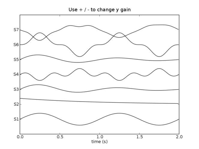
Here is an example of how that application does multiline plotting with "in place" gain changes. Note that this will break the y behavior of the toolbar because we have changed all the default transforms. In my application I have a custom toolbar to increase or decrease the y scale. In this example, I bind the plus/minus keys to a function which increases or decreases the y gain. Perhaps I will take this and wrap it up into a function called plot_signals or something like that because the code is a bit hairy since it makes heavy use of the somewhat arcane matplotlib transforms. I suggest reading up on the transforms module before trying to understand this example:
   1 from pylab import figure, show, setp, connect, draw
   2 from matplotlib.numerix import sin, cos, exp, pi, arange
   3 from matplotlib.numerix.mlab import mean
   4 from matplotlib.transforms import Bbox, Value, Point, \
   5      get_bbox_transform, unit_bbox
   6 # load the data
   7
   8 t = arange(0.0, 2.0, 0.01)
   9 s1 = sin(2*pi*t)
  10 s2 = exp(-t)
  11 s3 = sin(2*pi*t)*exp(-t)
  12 s4 = sin(2*pi*t)*cos(4*pi*t)
  13 s5 = s1*s2
  14 s6 = s1-s4
  15 s7 = s3*s4-s1
  16
  17 signals = s1, s2, s3, s4, s5, s6, s7
  18 for sig in signals:
  19     sig = sig-mean(sig)
  20
  21 lineprops = dict(linewidth=1, color='black', linestyle='-')
  22 fig = figure()
  23 ax = fig.add_axes([0.1, 0.1, 0.8, 0.8])
  24
  25 # The normal matplotlib transformation is the view lim bounding box
  26 # (ax.viewLim) to the axes bounding box (ax.bbox).  Where are going to
  27 # define a new transform by defining a new input bounding box. See the
  28 # matplotlib.transforms module helkp for more information on
  29 # transforms
  30
  31 # This bounding reuses the x data of the viewLim for the xscale -10 to
  32 # 10 on the y scale.  -10 to 10 means that a signal with a min/max
  33 # amplitude of 10 will span the entire vertical extent of the axes
  34 scale = 10
  35 boxin = Bbox(
  36     Point(ax.viewLim.ll().x(), Value(-scale)),
  37     Point(ax.viewLim.ur().x(), Value(scale)))
  38
  39
  40 # height is a lazy value
  41 height = ax.bbox.ur().y() - ax.bbox.ll().y()
  42
  43 boxout = Bbox(
  44     Point(ax.bbox.ll().x(), Value(-0.5) * height),
  45     Point(ax.bbox.ur().x(), Value( 0.5) * height))
  46
  47
  48 # matplotlib transforms can accepts an offset, which is defined as a
  49 # point and another transform to map that point to display.  This
  50 # transform maps x as identity and maps the 0-1 y interval to the
  51 # vertical extent of the yaxis.  This will be used to offset the lines
  52 # and ticks vertically
  53 transOffset = get_bbox_transform(
  54     unit_bbox(),
  55     Bbox( Point( Value(0), ax.bbox.ll().y()),
  56           Point( Value(1), ax.bbox.ur().y())
  57           ))
  58
  59 # now add the signals, set the transform, and set the offset of each
  60 # line
  61 ticklocs = []
  62 for i, s in enumerate(signals):
  63     trans = get_bbox_transform(boxin, boxout)
  64     offset = (i+1.)/(len(signals)+1.)
  65     trans.set_offset( (0, offset), transOffset)
  66
  67     ax.plot(t, s, transform=trans, **lineprops)
  68     ticklocs.append(offset)
  69
  70
  71 ax.set_yticks(ticklocs)
  72 ax.set_yticklabels(['S%d'%(i+1) for i in range(len(signals))])
  73
  74 # place all the y tick attributes in axes coords
  75 all = []
  76 labels = []
  77 ax.set_yticks(ticklocs)
  78 for tick in ax.yaxis.get_major_ticks():
  79     all.extend(( tick.label1, tick.label2, tick.tick1line,
  80                  tick.tick2line, tick.gridline))
  81     labels.append(tick.label1)
  82
  83 setp(all, transform=ax.transAxes)
  84 setp(labels, x=-0.01)
  85
  86 ax.set_xlabel('time (s)')
  87
  88
  89 # Because we have hacked the transforms, you need a special method to
  90 # set the voltage gain; this is a naive implementation of how you
  91 # might want to do this in real life (eg make the scale changes
  92 # exponential rather than linear) but it gives you the idea
  93 def set_ygain(direction):
  94     set_ygain.scale += direction
  95     if set_ygain.scale <=0:
  96         set_ygain.scale -= direction
  97         return
  98
  99     for line in ax.lines:
 100         trans = line.get_transform()
 101         box1 =  trans.get_bbox1()
 102         box1.intervaly().set_bounds(-set_ygain.scale, set_ygain.scale)
 103     draw()
 104 set_ygain.scale = scale
 105
 106 def keypress(event):
 107     if event.key in ('+', '='): set_ygain(-1)
 108     elif event.key in ('-', '_'): set_ygain(1)
 109
 110 connect('key_press_event', keypress)
 111 ax.set_title('Use + / - to change y gain')
 112 show()
