Producing Graphs for Publication using LaTeX
This page describes several ways to produce publication quality graphics with LaTeX.
LaTeX UsingTex
This section describes a technique following the Cookbook/Matplotlib/UsingTex guidelines.
Here is the outline of the LaTeX file used to include the figure (example for REVTeX4 for publication is APS physics journals with a two column format.)
\documentclass[prl,10pt,twocolumn]{revtex4}
\usepackage{graphicx}    % Used to import the graphics
\begin{document}
%...
\begin{figure}[t]
  \begin{center}
    \showthe\columnwidth % Use this to determine the width of the figure.
    \includegraphics[width=\columnwidth]{fig1.eps}
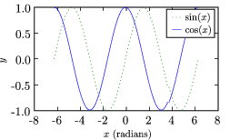
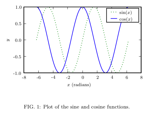
    \caption{\label{fig:sin_cos} Plot of the sine and cosine functions.}
  \end{center}
\end{figure}
%...
\end{document}
Determining the Figure Size
The first step is to determine the size of the figure: this way, when the graphic is included, it will not be resized, and the fonts etc. will be exactly as you set them rather than scaled (and possibly distored). This can be done in LaTeX by explicitly setting the width of the figure and using the \showthe command to print this width. (In the example above, the figure width is set to the \columnwidth.)
When the file is processed by LaTeX, look at the output. The example above produces the following output (Note: LaTeX will pause after the \showthe command, press enter to continue):
This is TeX, Version 3.14159 (Web2C 7.4.5)
LaTeX2e <2001/06/01>
...
> 246.0pt.
l.8     \showthe\columnwidth
                             % Use this to determine the width of the figure.
?
<fig1.eps> [1] (./tst.aux) )
...
Thus, the figure will be 246.0pt wide. There are 1 inch = 72.27pt (in [La]TeX), so this means that the figure width should be 3.40390 inches. The heigth depends on the content of the figure, but the golden mean may be used to make a pleasing figure. Once this is determined, the figure.figsize property can be used to set the default figure size.
fig_width_pt = 246.0  # Get this from LaTeX using \showthe\columnwidth
inches_per_pt = 1.0/72.27               # Convert pt to inches
golden_mean = (sqrt(5)-1.0)/2.0         # Aesthetic ratio
fig_width = fig_width_pt*inches_per_pt  # width in inches
fig_height =fig_width*golden_mean       # height in inches
fig_size = [fig_width,fig_height]
Setting Font Sizes
Since the figure will not be scaled down, we may explicitly set the font sizes.
          'font.size' : 10,
          'axes.labelsize' : 10,
          'font.size' : 10,
          'text.fontsize' : 10,
          'legend.fontsize': 10,
          'xtick.labelsize' : 8,
          'ytick.labelsize' : 8,
Fine Tuning
With these smaller plot sizes, the default margins are not enough to display the axis labels, so we need to specify large margins. We do this with an explicit call to the axes() function. In this example, we only have one axis. The typeset LaTeX document will have whitespace on either side of the figure, so we do not need to include this in the figure. Thus, we keep just a bit of whitespace at the top and to the right so that the labels do not extend beyond the bounding box, and add more space to the bottom for the x label:
pylab.axes([0.125,0.2,0.95-0.125,0.95-0.2])
Putting it all Together
Here is the python file that generates the plots.
   1 import pylab
   2 from pylab import arange,pi,sin,cos,sqrt
   3 fig_width_pt = 246.0  # Get this from LaTeX using \showthe\columnwidth
   4 inches_per_pt = 1.0/72.27               # Convert pt to inch
   5 golden_mean = (sqrt(5)-1.0)/2.0         # Aesthetic ratio
   6 fig_width = fig_width_pt*inches_per_pt  # width in inches
   7 fig_height = fig_width*golden_mean      # height in inches
   8 fig_size =  [fig_width,fig_height]
   9 params = {'backend': 'ps',
  10           'axes.labelsize': 10,
  11           'text.fontsize': 10,
  12           'legend.fontsize': 10,
  13           'xtick.labelsize': 8,
  14           'ytick.labelsize': 8,
  15           'text.usetex': True,
  16           'figure.figsize': fig_size}
  17 pylab.rcParams.update(params)
  18 # Generate data
  19 x = pylab.arange(-2*pi,2*pi,0.01)
  20 y1 = sin(x)
  21 y2 = cos(x)
  22 # Plot data
  23 pylab.figure(1)
  24 pylab.clf()
  25 pylab.axes([0.125,0.2,0.95-0.125,0.95-0.2])
  26 pylab.plot(x,y1,'g:',label='$\sin(x)$')
  27 pylab.plot(x,y2,'-b',label='$\cos(x)$')
  28 pylab.xlabel('$x$ (radians)')
  29 pylab.ylabel('$y$')
  30 pylab.legend()
  31 pylab.savefig('fig1.eps')

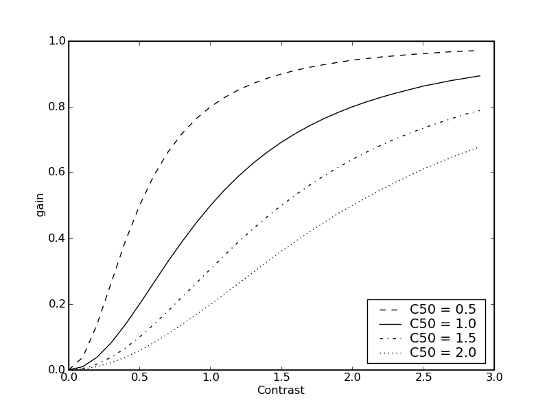
producing gray scale dashed plots
An obvious solution is to greyscale convert your figure, but for readibility, adding dashes is often better.. This maybe implemented for an example of a SigmoidalFunctions with
from pylab import *
from numpy import mod

dashes = ['--', #    : dashed line
          '-', #     : solid line
          '-.', #   : dash-dot line
          ':', #    : dotted line
           '-']

def NR(C,C50,n):
    return (  ( C / C50)**n /( 1 + ( C / C50)**n ))

figure(1)
C = arange(0.0,3.0,0.1)
C50 = arange(0.5,2.5,0.5)

for i,c50 in enumerate(C50):
    plot(C, NR(C,c50,2), label = 'C50 = ' + str(c50), c= 'k', linestyle = dashes[mod(i,len(dashes))] )

xlabel('Contrast')
ylabel('gain')
legend(loc='lower right')
savefig('naka-rushton.png')

LaTeX using psfrag
Note: This section is obsolete. Recent versions matplotlib break the psfrag functionality (see for example this discussion. That being said, one can use the usetex feature to render the LaTeX text directly with very good results (if you are careful about choosing fonts). I will try to discuss this here further in the near future. -- MichaelMcNeilForbes
To ensure that your graphics use exactly the same fonts as your document, you can have LaTeX generate and substitute the text for your graph using the psfrag package. This is a good option if you have problems with the text.usetex method (for example, if the appropriate fonts cannot be found.)
To do this, simply use plain text for the labels and then replace them using the psfrag package. Here are the modified files to make use of this method:
\documentclass[prl,10pt,twocolumn]{revtex4}
\usepackage{graphicx}    % Used to import the graphics
\usepackage{psfrag}
\begin{document}
%...
\begin{figure}[t]
  \begin{center}
    \psfrag{sin(x)}{$\sin(x)$}
    \psfrag{cos(x)}{$\cos(x)$}
    \psfrag{x (radians)}{$x$ (radians)}
    \psfrag{y}{$y$}
    {\footnotesize                  % Replace tick-lables with smaller font.
      \psfrag{1.0}{1.0}
      \psfrag{0.5}{0.5}
      \psfrag{0.0}{0.0}
      \psfrag{-0.5}{-0.5}
      \psfrag{-1.0}{-1.0}
      \psfrag{-8}{-8}
      \psfrag{-6}{-6}
      \psfrag{-4}{-4}
      \psfrag{-2}{-2}
      \psfrag{0}{0}
      \psfrag{2}{2}
      \psfrag{4}{4}
      \psfrag{6}{6}
      \psfrag{8}{8}
      \showthe\columnwidth % Use this to determine the width of the figure.
      \includegraphics[width=\columnwidth]{fig2.eps}
    } % Note that the psfrag commands only work in the top-most environment.
    \caption{\label{fig:sin_cos} Plot of the sine and cosine functions.}
  \end{center}
\end{figure}
%...
\end{document}
1 import pylab
2 from pylab import arange,pi,sin,cos,sqrt
3 fig_width_pt = 246.0 # Get this from LaTeX using \showthe\columnwidth
4 inches_per_pt = 1.0/72.27 # Convert pt to inch
5 golden_mean = (sqrt(5)-1.0)/2.0 # Aesthetic ratio
6 fig_width = fig_width_pt*inches_per_pt # width in inches
7 fig_height = fig_width*golden_mean # height in inches
8 fig_size = [fig_width,fig_height]
9 params = {'backend': 'ps',
10 'axes.labelsize': 10,
11 'text.fontsize': 10,
12 'legend.fontsize': 10,
13 'xtick.labelsize': 8,
14 'ytick.labelsize': 8,
15 'text.usetex': False,
16 'figure.figsize': fig_size}
17 pylab.rcParams.update(params)
18 # Generate data
19 x = pylab.arange(-2*pi,2*pi,0.01)
20 y1 = sin(x)
21 y2 = cos(x)
22 # Plot data
23 # Plot data
24 pylab.figure(1)
25 pylab.clf()
26 pylab.axes([0.125,0.2,0.95-0.125,0.95-0.2])
27 pylab.plot(x,y1,'g:',label='sin(x)')
28 pylab.plot(x,y2,'-b',label='cos(x)')
29 pylab.xlabel('x (radians)')
30 pylab.ylabel('y')
31 pylab.legend()
32 pylab.savefig('fig2.eps')

Odds and Ends
Another way to set the legend fonts after the legend has been drawn is to use, for example:
from matplotlib.font_manager import fontManager, FontProperties
font= FontProperties(size='x-small');
pylab.legend(loc=0, prop=font);
-- DavidDonovan
PDF File Size
If you have very complex images such as high-resolution contour plots or three-dimensional plots, saving these to vector graphic formats like PDF or EPS can result in unacceptably large files (though with the ability for stunning zooms). One solution is to selectively convert parts of the plot (not the text labels) to a rasterized image. This can be done with the so-called "mixed-mode rendering" capability in recent versions of matplotlib. Here is an example as it should probably work:
however, contourf currently does not support the rasterized option (which is silently ignored). Some other plot elements do however. I am looking into a solution for this. -- MichaelMcNeilForbes