plot#
- FitResult.plot(ax=None, *, plot_type='hist')[source]#
Visually compare the data against the fitted distribution.
Available only if
matplotlibis installed.- Parameters:
- ax
matplotlib.axes.Axes Axes object to draw the plot onto, otherwise uses the current Axes.
- plot_type{“hist”, “qq”, “pp”, “cdf”}
Type of plot to draw. Options include:
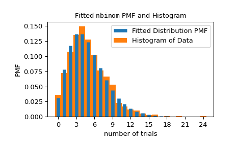
“hist”: Superposes the PDF/PMF of the fitted distribution over a normalized histogram of the data.
“qq”: Scatter plot of theoretical quantiles against the empirical quantiles. Specifically, the x-coordinates are the values of the fitted distribution PPF evaluated at the percentiles
(np.arange(1, n) - 0.5)/n, wherenis the number of data points, and the y-coordinates are the sorted data points.“pp”: Scatter plot of theoretical percentiles against the observed percentiles. Specifically, the x-coordinates are the percentiles
(np.arange(1, n) - 0.5)/n, wherenis the number of data points, and the y-coordinates are the values of the fitted distribution CDF evaluated at the sorted data points.“cdf”: Superposes the CDF of the fitted distribution over the empirical CDF. Specifically, the x-coordinates of the empirical CDF are the sorted data points, and the y-coordinates are the percentiles
(np.arange(1, n) - 0.5)/n, wherenis the number of data points.
- ax
- Returns:
- ax
matplotlib.axes.Axes The matplotlib Axes object on which the plot was drawn.
- ax
Examples
>>> import numpy as np
>>> from scipy import stats
>>> import matplotlib.pyplot as plt  # matplotlib must be installed
>>> rng = np.random.default_rng()
>>> data = stats.nbinom(5, 0.5).rvs(size=1000, random_state=rng)
>>> bounds = [(0, 30), (0, 1)]
>>> res = stats.fit(stats.nbinom, data, bounds)
>>> ax = res.plot()  # save matplotlib Axes object
The
matplotlib.axes.Axesobject can be used to customize the plot. Seematplotlib.axes.Axesdocumentation for details.>>> ax.set_xlabel('number of trials') # customize axis label >>> ax.get_children()[0].set_linewidth(5) # customize line widths >>> ax.legend() >>> plt.show()